Cloudways Unified UX - A redesign that contributed to a $350M acquisition
Company
Cloudways by Digital Ocean
Year
2021
Scope of Work
By 2021, Cloudways had a UX problem that most fast-growing SaaS platforms recognise too late. The desktop, tablet, and mobile experiences had drifted so far apart that users described switching devices as switching products. Task abandonment was rising. Support tickets were climbing. Users were routing parts of their hosting work to competitors with more consistent UX. At the same time, DigitalOcean was beginning acquisition conversations. The platform was about to be evaluated at a level it had never faced before.
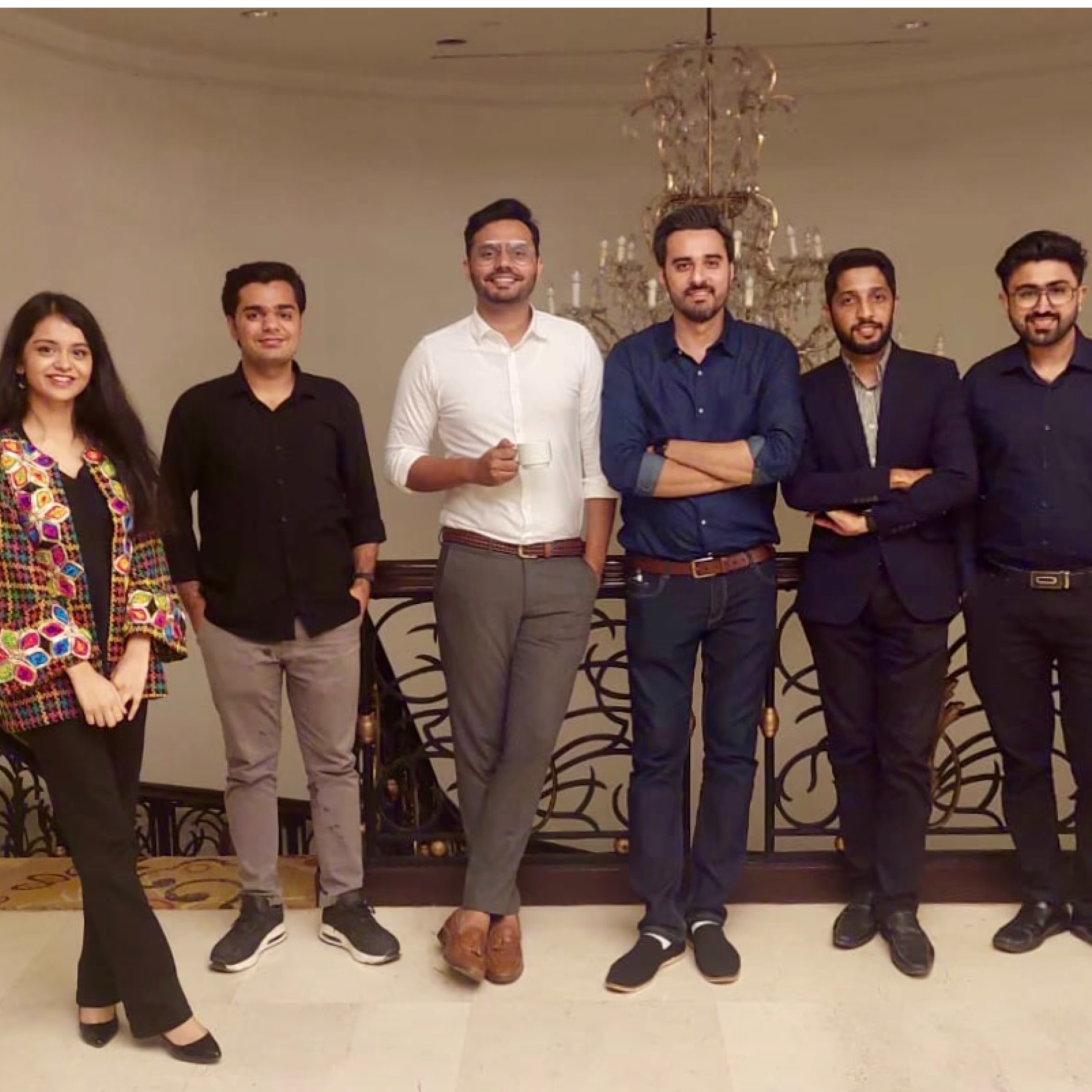
As Product Design Manager and sole researcher, I led this project end to end. I ran the research, benchmarked the platform against three competitors across seven critical tasks, and built the Atmosphere Design System from scratch with Ali, who ran design systems throughout and whose work I audited at every stage. Nauman led UI execution alongside Ali, with Rameesha joining the team after sprint one launched. The redesign shipped. The metrics moved. Months later, DigitalOcean acquired Cloudways for $350M. The CEO thanked the design team after the deal closed.
01 - The situation
A platform that worked differently on every device was quietly pushing users toward competitors.
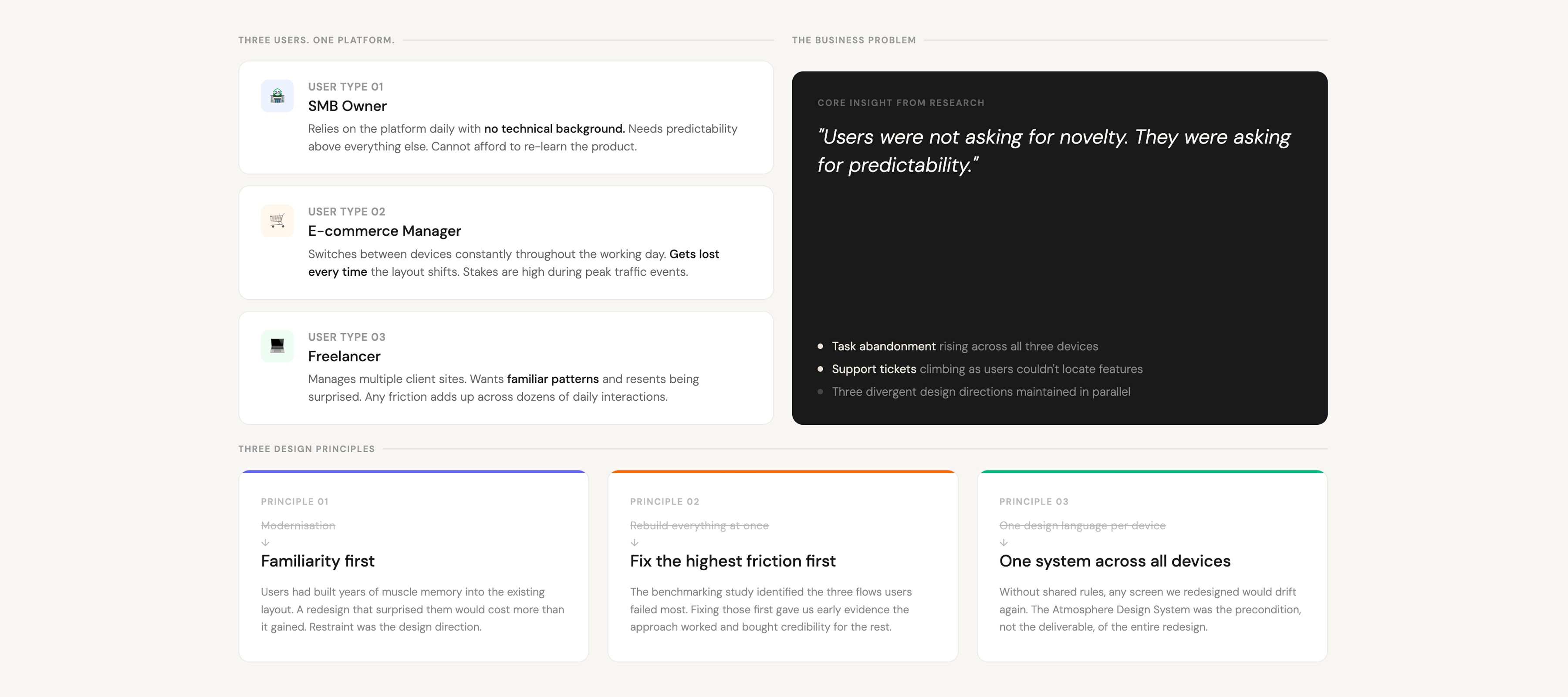
Cloudways had a fragmented product. SMB owners, e-commerce managers, and freelancers managing multiple websites daily were logging into a platform that looked and behaved differently across desktop, tablet, and mobile. Navigation patterns changed between devices. Visual language was inconsistent. Flows that worked on one screen broke on another. Users were not abandoning the product entirely. They were quietly routing parts of their workflow to competitors with smoother experiences, and Cloudways was losing ground without a single visible crisis to point to.
The business consequence was real. Task abandonment was climbing, support tickets were rising, and the cost of maintaining three effectively separate design languages was compounding. Cloudways needed the platform to feel like one product across every device, not three products sharing a logo.
I was Product Design Manager and the sole researcher on this project. I ran every research activity: qualitative interviews with users, competitive benchmarking across three platforms, and usability testing across the full redesign. Nauman and Ali led design execution under my direction, with me auditing all of Ali's design system work throughout. Rameesha joined the team after sprint one launched and contributed to the later phases of the project. This work directly preceded and contributed to the $350M acquisition of Cloudways by DigitalOcean.
02 - The insight
Stakeholders thought the new design was too empty. Users thought it was exactly right.
The assumption going into the visual redesign was that both users and internal stakeholders would respond positively to a cleaner, more minimal interface. What the research revealed was a direct split. Long-tenured stakeholders, some with ten to fifteen years at the company, found the new direction too white, too clean, too empty. They were accustomed to the density of the old design and mistook familiarity for usability.
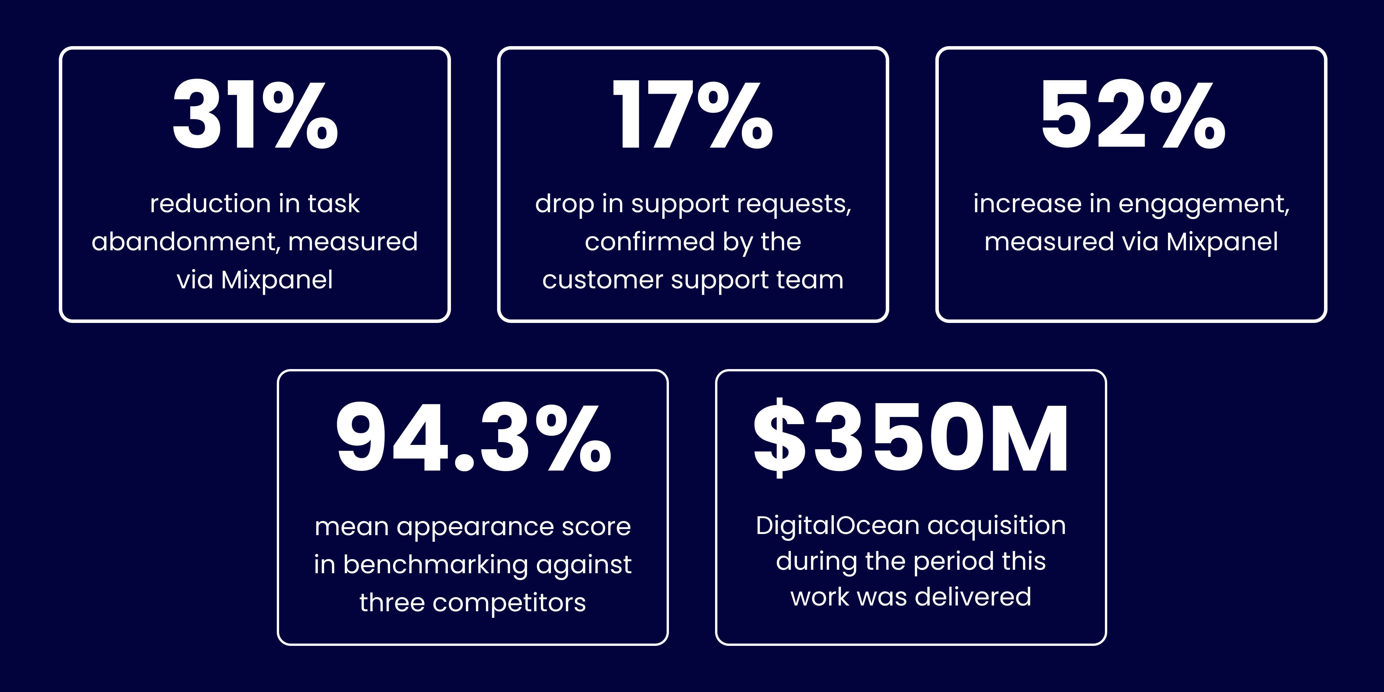
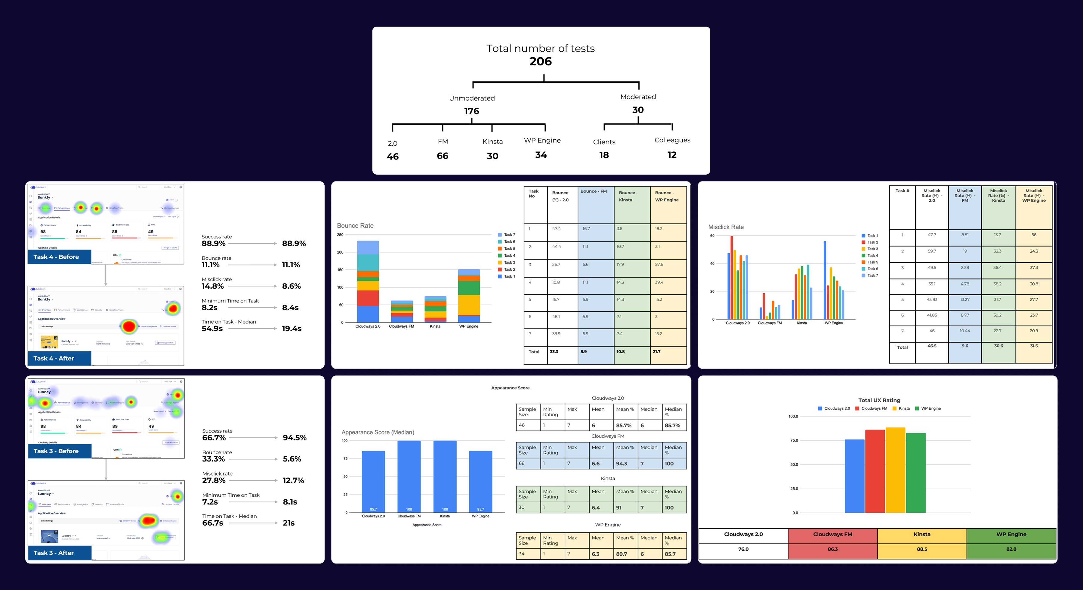
Users told a completely different story. In benchmarking research across 66 participants on a 7-point scale, Cloudways FM scored a mean appearance rating of 94.3%, with a median of 100%. That placed us above Kinsta at 91% and WP Engine at 89.7%. The users most at risk of churning were not bothered by the minimal design. They preferred it. That finding did not just validate the visual direction. It ended the internal debate.
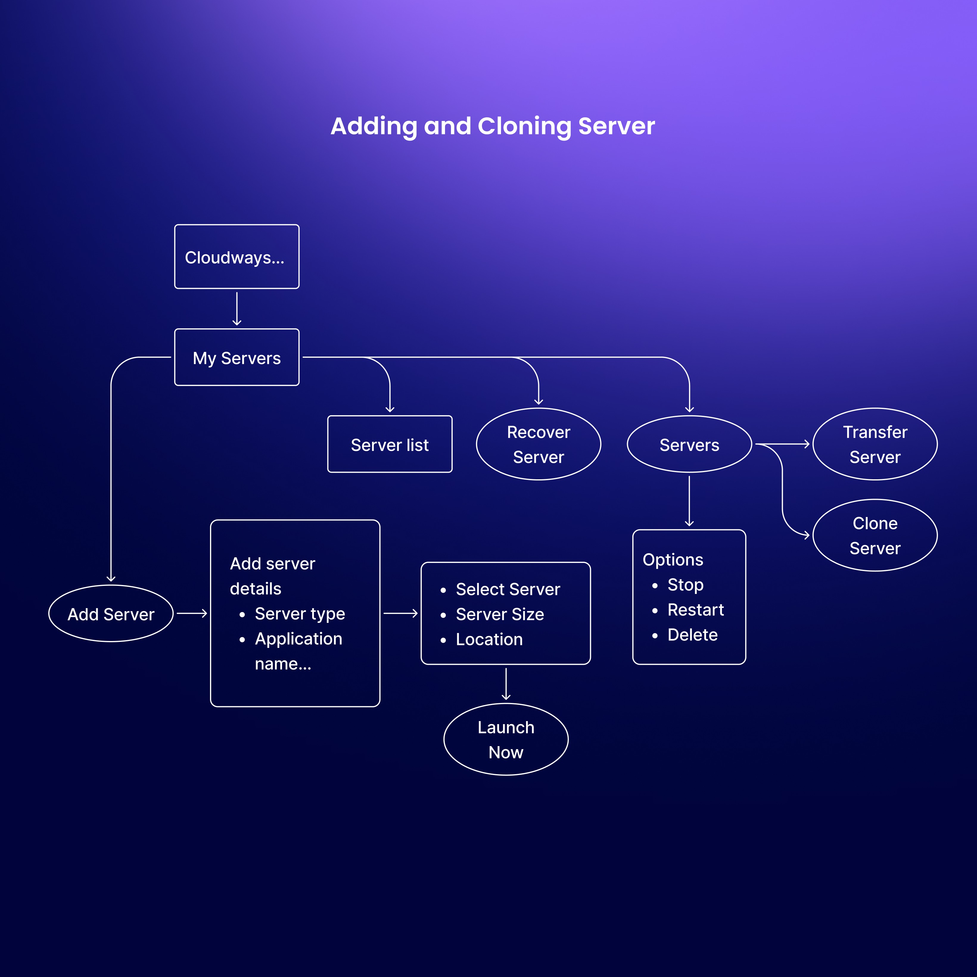
03 - The design system
We built Atmosphere first because consistency at component level was the only way to guarantee consistency at platform level.
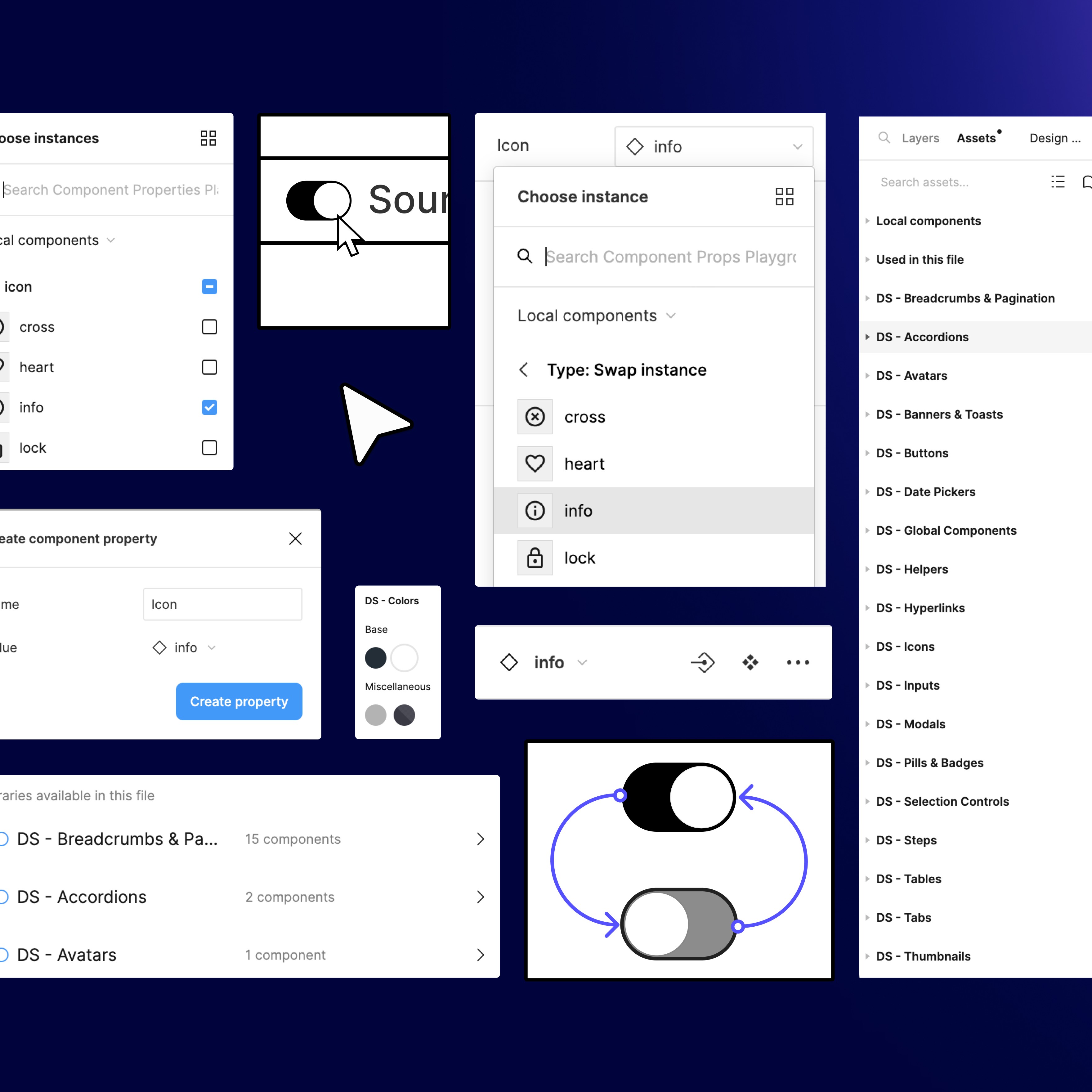
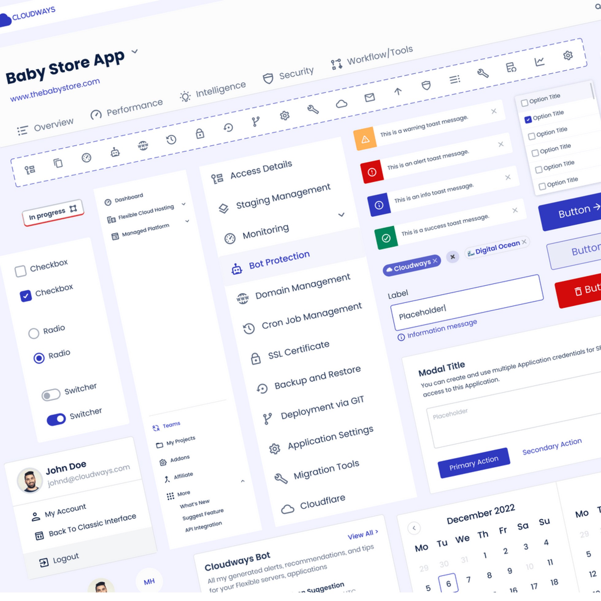
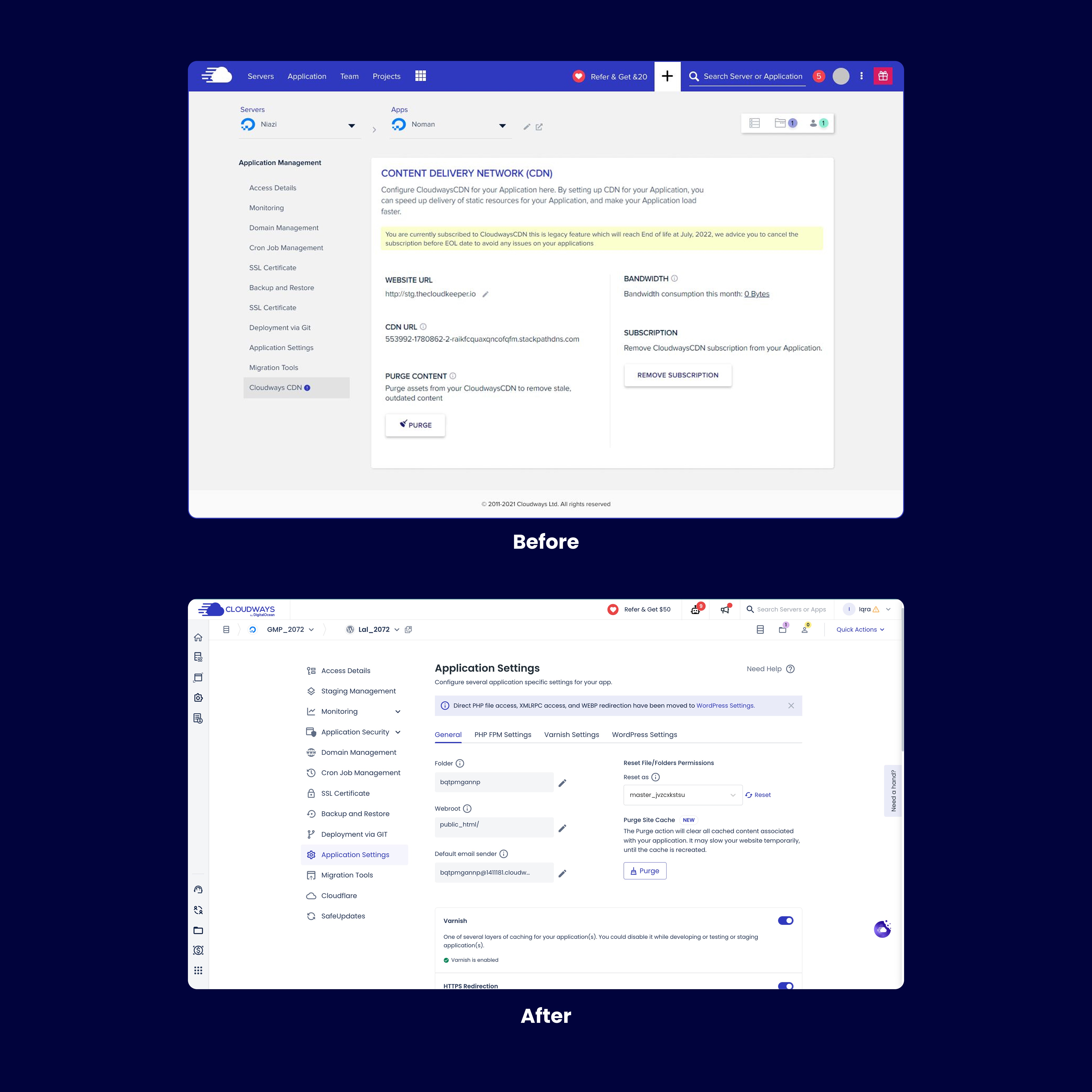
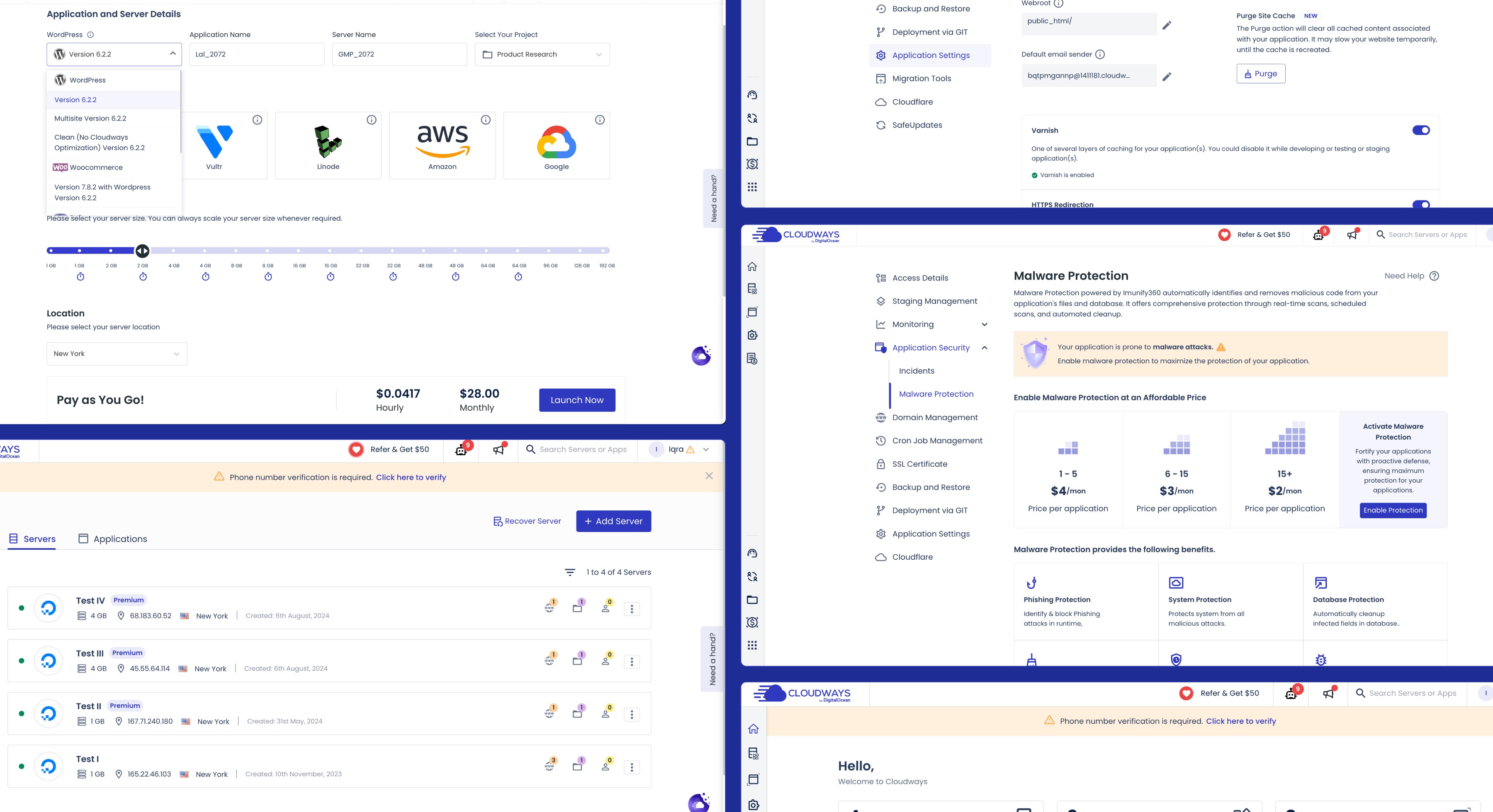
The Unified UX project could not be solved screen by screen. The fragmentation was systemic, which meant the fix had to be systemic. Before redesigning a single flow, I made the decision to build the Atmosphere Design System as the foundation. Ali led the system's construction throughout the project, building reusable components, scalable typography, a shared colour system, and modular layouts that could adapt across desktop, tablet, and mobile without breaking visual coherence. I audited every component and pattern he produced before it was adopted into the platform.
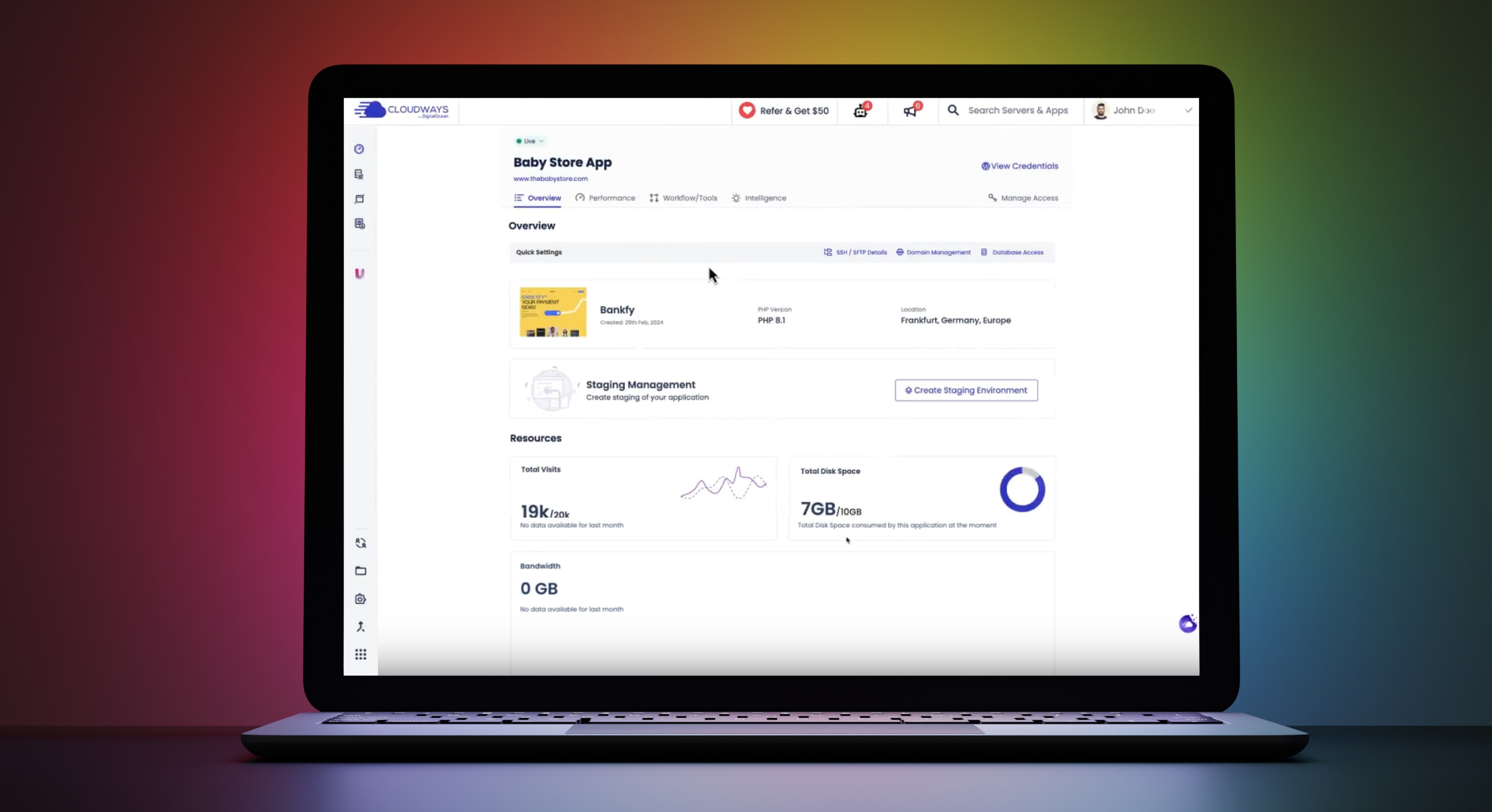
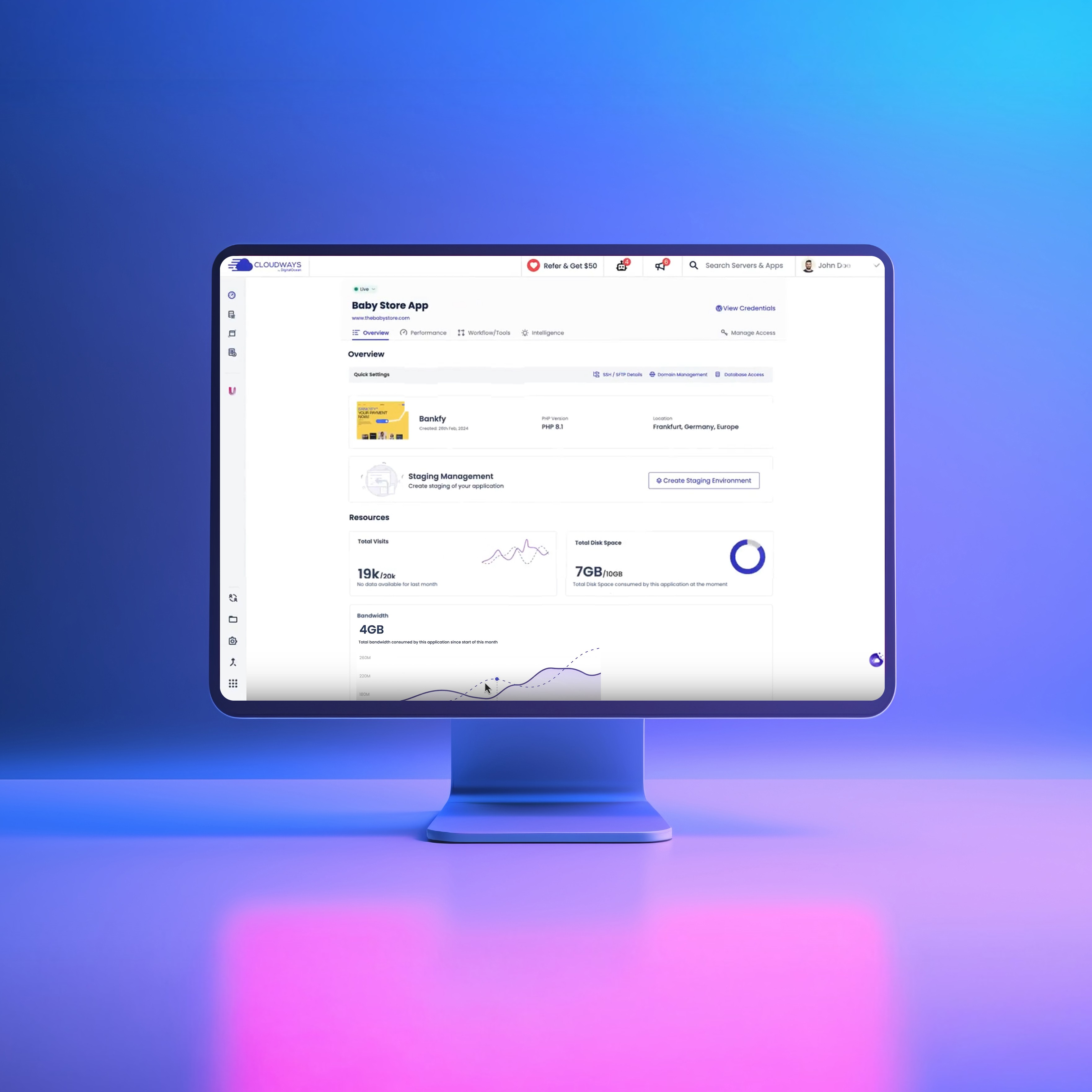
The system meant that every screen Nauman and Rameesha produced was consistent by default rather than by manual review. It removed the possibility of the fragmentation we were fixing from reappearing in future releases. Atmosphere is live at zeroheight.com/0f396b4ae.
04 - The decisions
We chose familiarity over novelty, and evidence over assumption.
The first decision was the design philosophy. Early in the project, user testing contradicted an assumption we had brought in. We expected users to want a fresh, modern look. What testing showed was that they wanted predictability. Familiar patterns, consistent iconography, navigation that behaved the same way every time. I made a deliberate call to modernise without reinventing. Every element we updated had to feel like an improvement on something the user already knew, not a replacement for it.
The second decision was around the Manage Access flow. I ran benchmarking against three competitors across seven tasks. Cloudways matched or outperformed in six. The seventh task, finding and managing access permissions, was where we matched competitors but could not surpass them. Users were spending too long hunting for a feature that should have been immediately reachable. Rather than accepting parity, I ran another design iteration specifically on that task. The solution was a Quick Settings bar that surfaced Manage Access directly. Post-redesign task success rate reached 97%. That single iteration closed the gap and turned our weakest benchmarked task into one of our strongest.
The third decision was responsive behaviour. Rather than designing desktop first and adapting down, we mapped each key flow across all three device types simultaneously. This added time to the process but caught layout conflicts early rather than during engineering handover. Every flow was reviewed in all three viewports before any screen was signed off.
05 - The challenge
The data said the design was right. Convincing people who had lived with the old one was a different problem.
The most sustained challenge on this project was not a design problem. It was a perception problem. A group of long-tenured stakeholders, including the customer support manager and others who had been with the company for a decade or more, consistently pushed back on the visual direction. They found the new interface too minimal, too stripped back. Their concern was genuine. They had built their understanding of the product around a denser, more cluttered interface and interpreted the cleanliness as a loss of information rather than an improvement in clarity.
I did not argue the point. I put the design in front of users. At the end of the benchmarking research, participants rated the appearance of Cloudways FM against three competitors on a 7-point Likert scale. The mean score came back at 94.3%, the median at 100%. We outperformed every competitor tested. I brought those numbers into the stakeholder review. When the evidence belongs to the users rather than the designer, it is very difficult to dismiss. The reservations stopped.
The lesson I took from that moment was specific to this project. Internal conviction is not enough to protect a good design decision. Structured evidence collected before the argument starts is the only thing that consistently works.
06 - The outcome
One platform, one experience, and a business that sold for $350M.
The redesign delivered a unified platform with consistent navigation, visual language, and interaction patterns across desktop, tablet, and mobile.
31% reduction in task abandonment, measured via Mixpanel. The primary driver was the navigation restructure, specifically surfacing frequently used features like Manage Access into a persistent Quick Settings bar rather than burying them in nested menus.
52% increase in engagement, measured via Mixpanel. Users who had previously completed only core tasks began exploring the platform more broadly. Consistent navigation reduced the cognitive load of finding features, which freed users to use more of the product.
17% drop in support requests within three months, confirmed directly by the customer support team. As users found features without assistance, the volume of how-do-I-find questions dropped significantly.
94.3% mean appearance score in benchmarking, with a median of 100% across 66 participants. This was the number that settled the internal debate and validated the visual direction.
As one user put it: "The new platform is so much easier to use, everything is right where I need it without me having to search for it." Another shared: "I can switch between devices without missing a beat. It is smooth, fast, and intuitive."
Cloudways was acquired by DigitalOcean for $350M. The Unified UX redesign was one of the platform improvements completed in the period leading up to that acquisition.
07 - The reflection
What I would do differently.
The decision I would revisit is the information architecture. I made a deliberate call not to restructure the full IA of the platform. The reasoning was sound: existing users had built workflows around the existing structure, and a full reorganisation risked alienating a loyal customer base at exactly the wrong moment. We improved the most critical flows and made navigation more consistent, but we did not challenge where things lived at a fundamental level.
In hindsight, I would have run a card sorting exercise before committing to that decision. Not to change the outcome necessarily, but to replace instinct with evidence. If card sorting had confirmed that users' mental models matched the existing structure, we could have proceeded with full confidence. If it had revealed mismatches, we would have had the data to make a stronger case for deeper restructuring. I made the right call, but I made it without the evidence that would have made it unassailable.
The second thing I would do differently is research sequencing. I ran qualitative interviews, benchmarking, and usability testing largely in sequence. On a project of this scale, running qualitative and benchmarking work in parallel would have saved several weeks and surfaced the competitive gaps earlier, giving us more design iteration time before handover.