Cloudways Autonomous - AI platform achieving an 89% task success rate in beta
Company
Cloudways by DigitalOcean
Year
2022
Scope of Work
For businesses running e-commerce sites, product launches, or live campaigns, a traffic spike is the moment everything either works or falls apart. Before Cloudways Autonomous, managing server capacity during those moments meant navigating complex technical interfaces, reacting to problems after they had already caused downtime, and dealing with billing surprises that made users afraid to turn on automation at all. The product was technically capable. It was not humanly usable.
As Lead Designer I owned the end-to-end UX strategy for what was internally called Autoscale before it launched as Cloudways Autonomous. I ran the user research, defined the design principles, managed a team of three designers, and worked directly with engineers, product managers, and data scientists to ship a product that served businesses of every technical level through a single coherent interface. The result was an 83% improvement in event reliability, a 52% drop in downtime, and a 76% beta retention rate across 200 businesses.
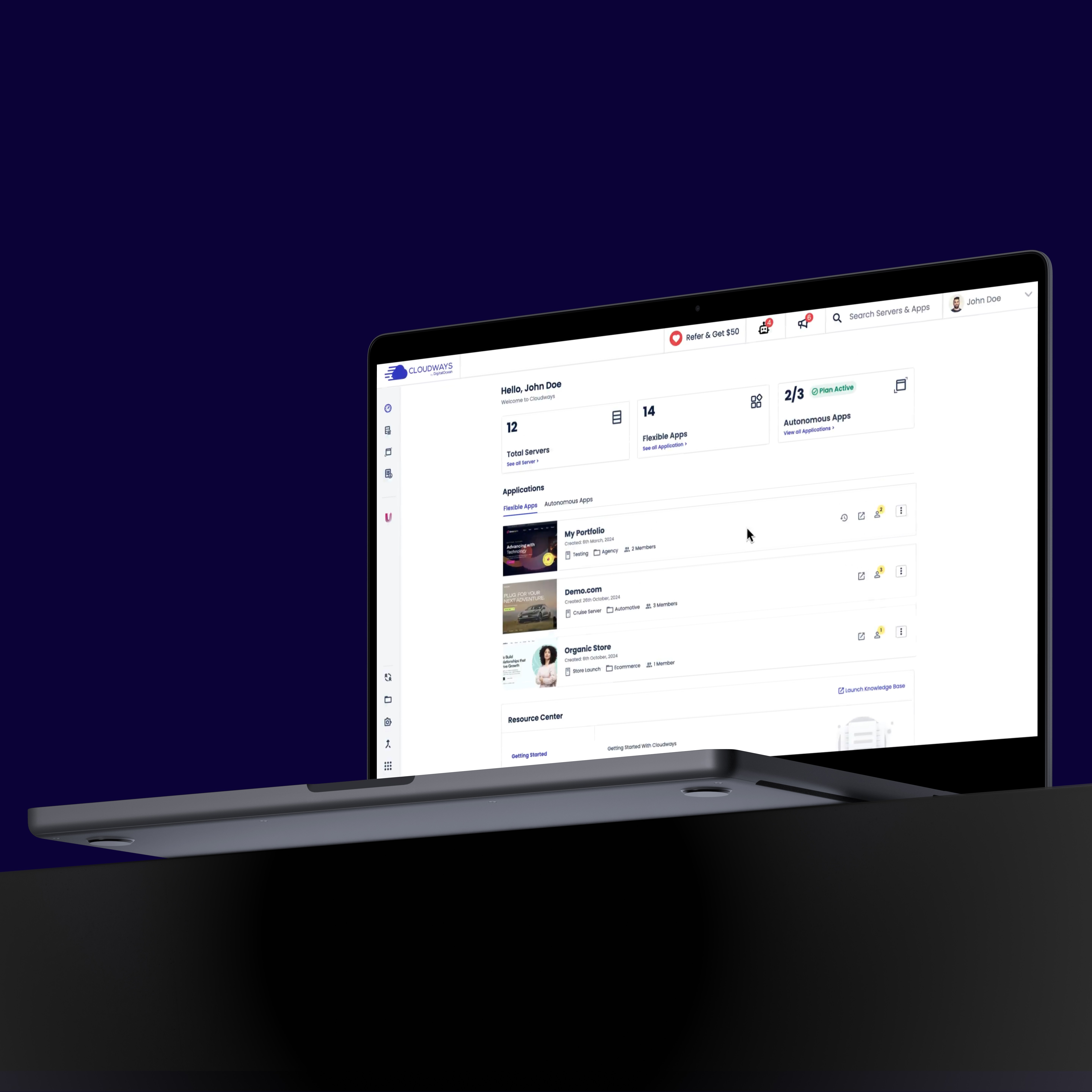
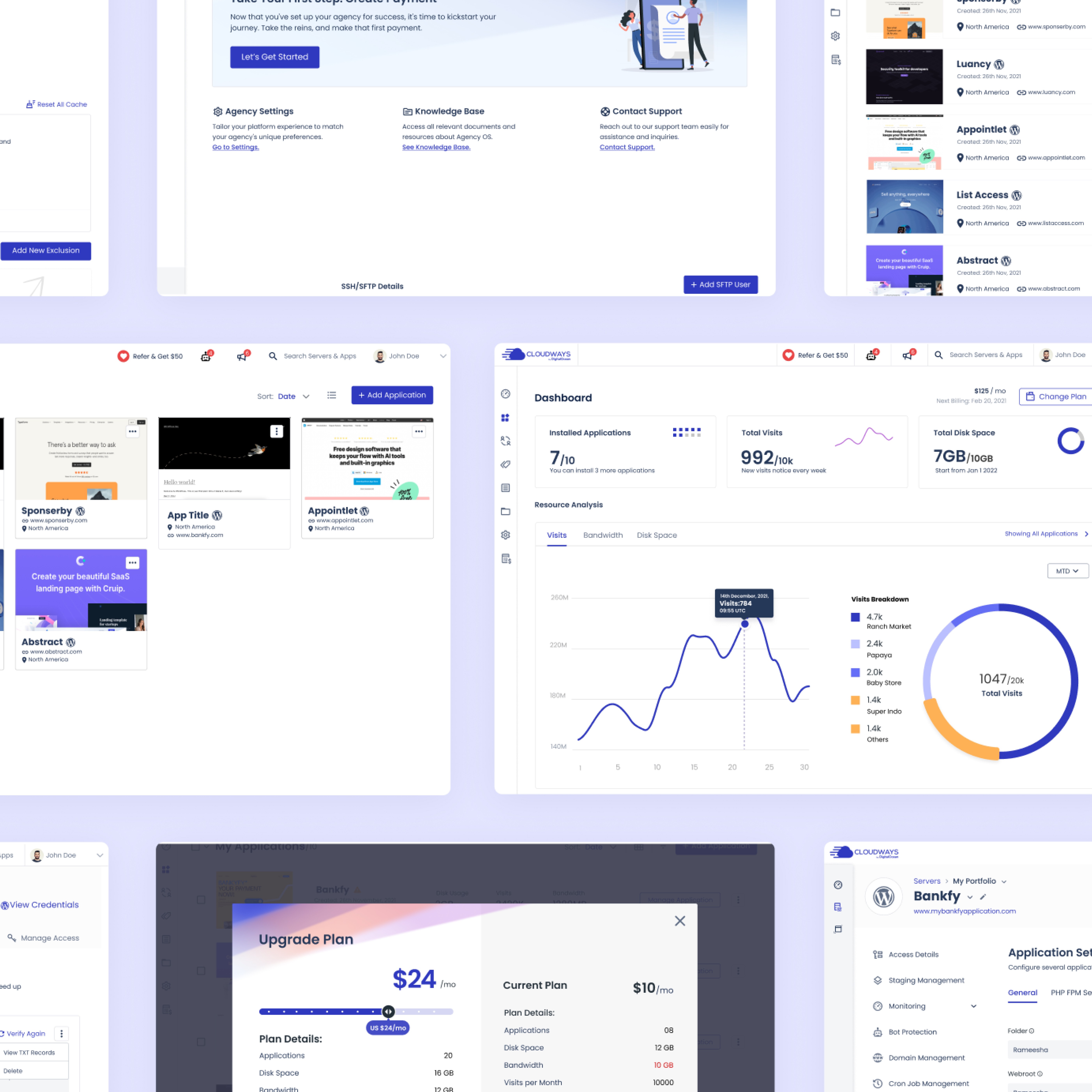
01 - The situation
The people most at risk during a server crash were the least equipped to prevent one.
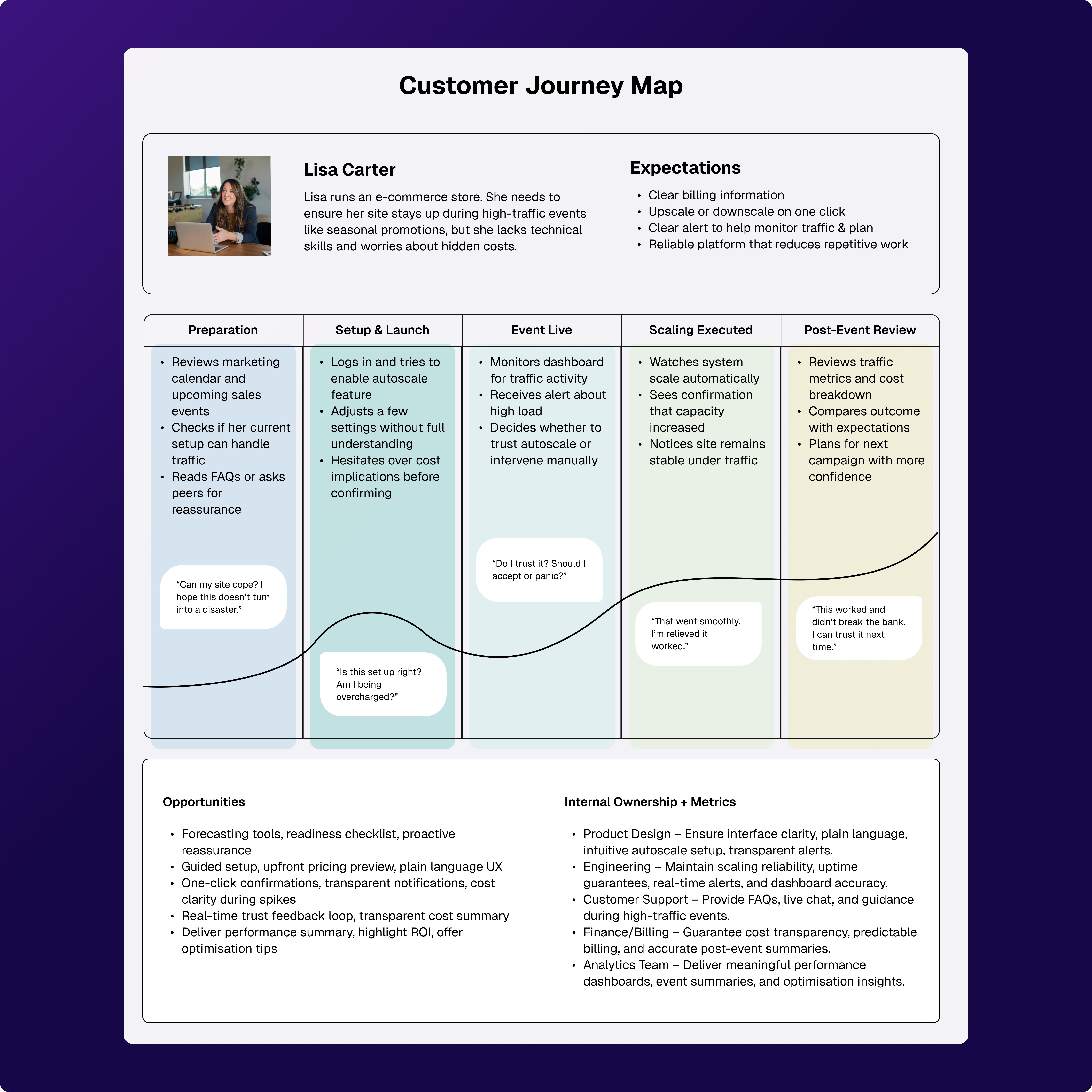
During the Cloudways Unified UX project, our research kept surfacing the same problem from a different angle. Non-technical business owners, the core of Cloudways' customer base, were expected to manually scale their servers before high-traffic events. Most did not know when to scale, by how much, or what the cost implications were. They either over-provisioned and overpaid, or under-provisioned and crashed. One of our researchers flagged this specifically after studying user behaviour around Black Friday. The cost of inaction was not abstract. It was a crashed store on the highest-revenue day of the year.
Cloudways recognised this as both a user problem and a significant market gap. Competitors were offering scaling tools, but all of them assumed technical fluency. There was no product in the market that made infrastructure decisions feel safe for someone who did not speak the language of servers. Autonomous was built to be that product.
I led the project with a team of three designers and one researcher. Ali owned the Atmosphere Design System implementation, with me auditing all his work throughout. Nauman and Ramesh led UI design across the platform. Iqra led qualitative research with users. My role covered end-to-end design leadership, from research strategy through to final delivery.
02 - The insight
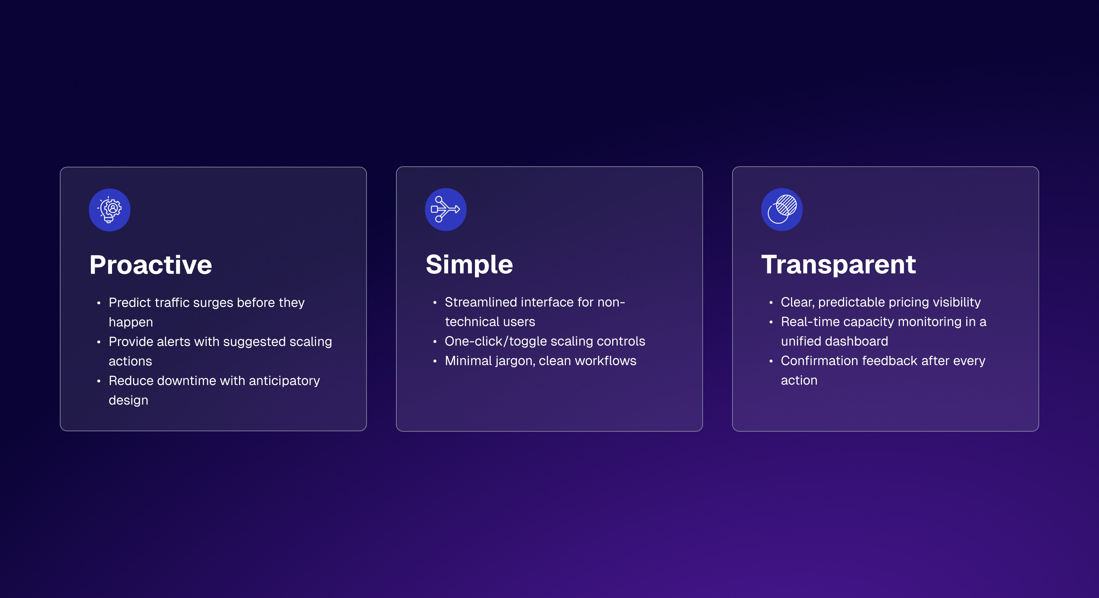
Users did not want more control. They wanted less to worry about.
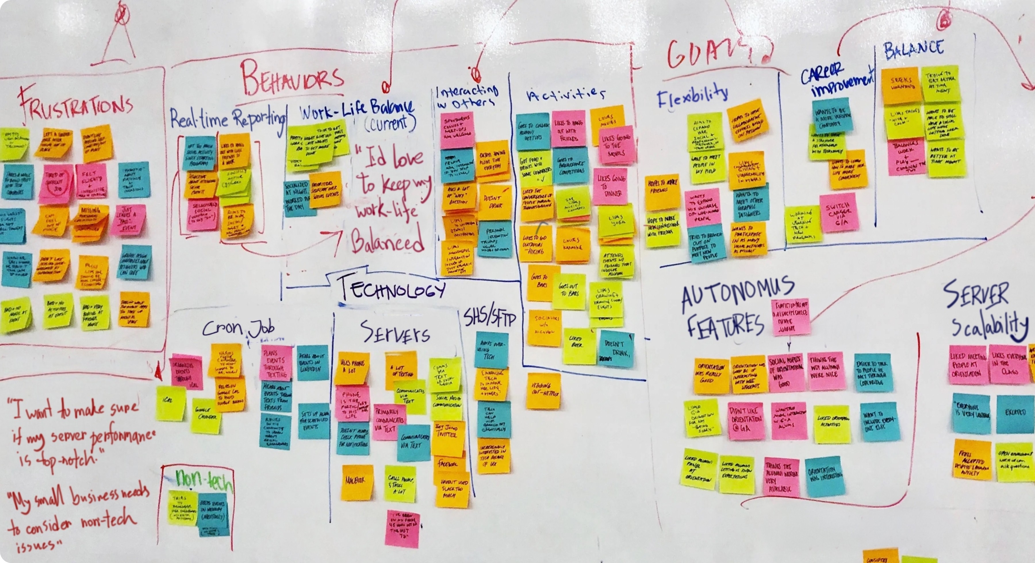
The assumption going into research was that users wanted better visibility into their server performance. We expected them to ask for more detailed dashboards, more granular controls, more data. What Iqra's interviews revealed was the opposite. Infrastructure managers and business owners did not want to spend more time in the platform. They wanted to spend less. As one user put it during testing: "I need to know when there's a problem, but I don't want to be flooded with technical data."
That single finding changed the design direction. We had been planning a feature-rich monitoring dashboard. We scaled it back. The product we built was not about giving users more power. It was about giving them confidence that the system was handling things without them. Every subsequent decision, the toggle over a multi-step form, the predictive alert over a manual check, the single slider over a configuration panel, came directly from that insight.
03 - The design system
We built on Atmosphere so the team could move fast without breaking consistency.
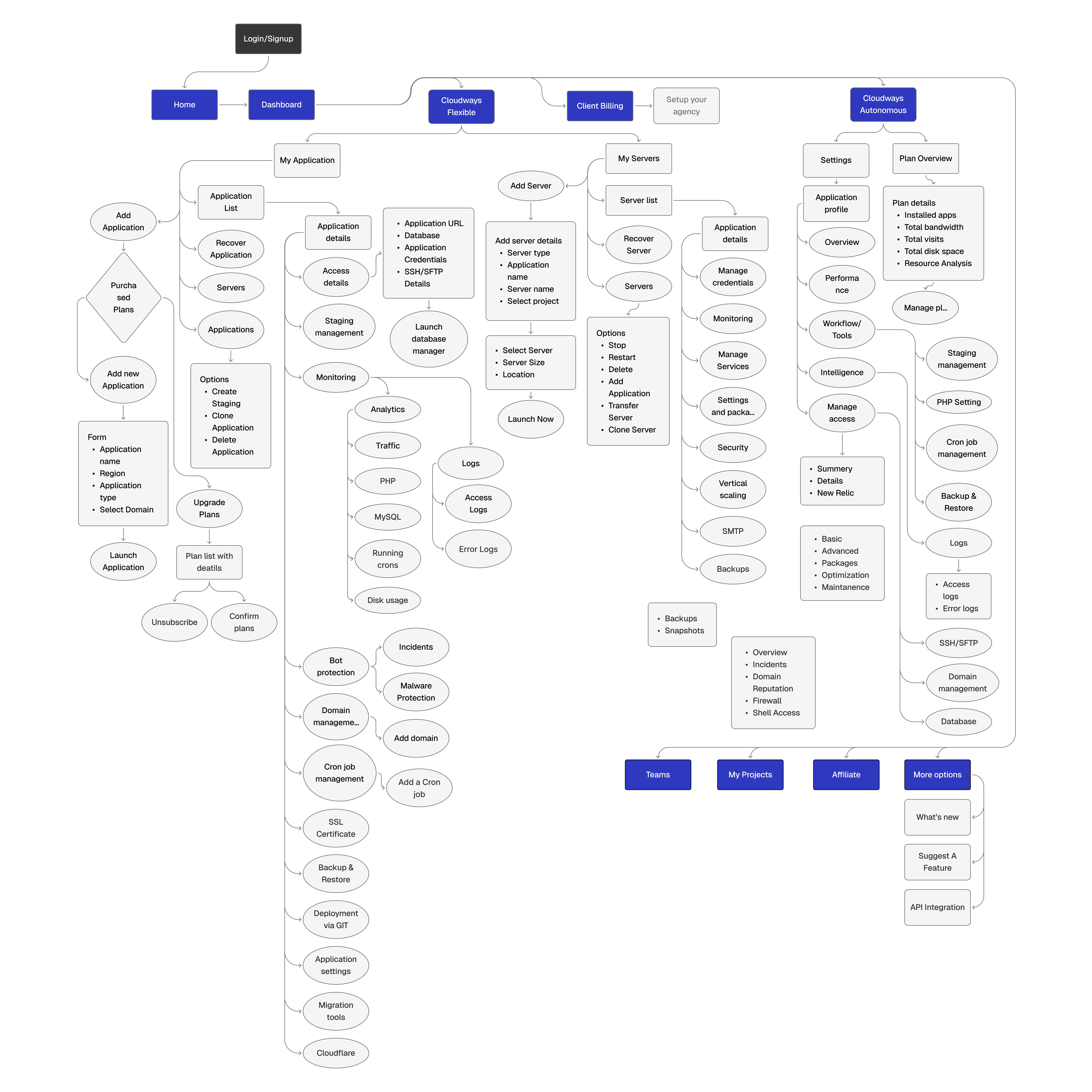
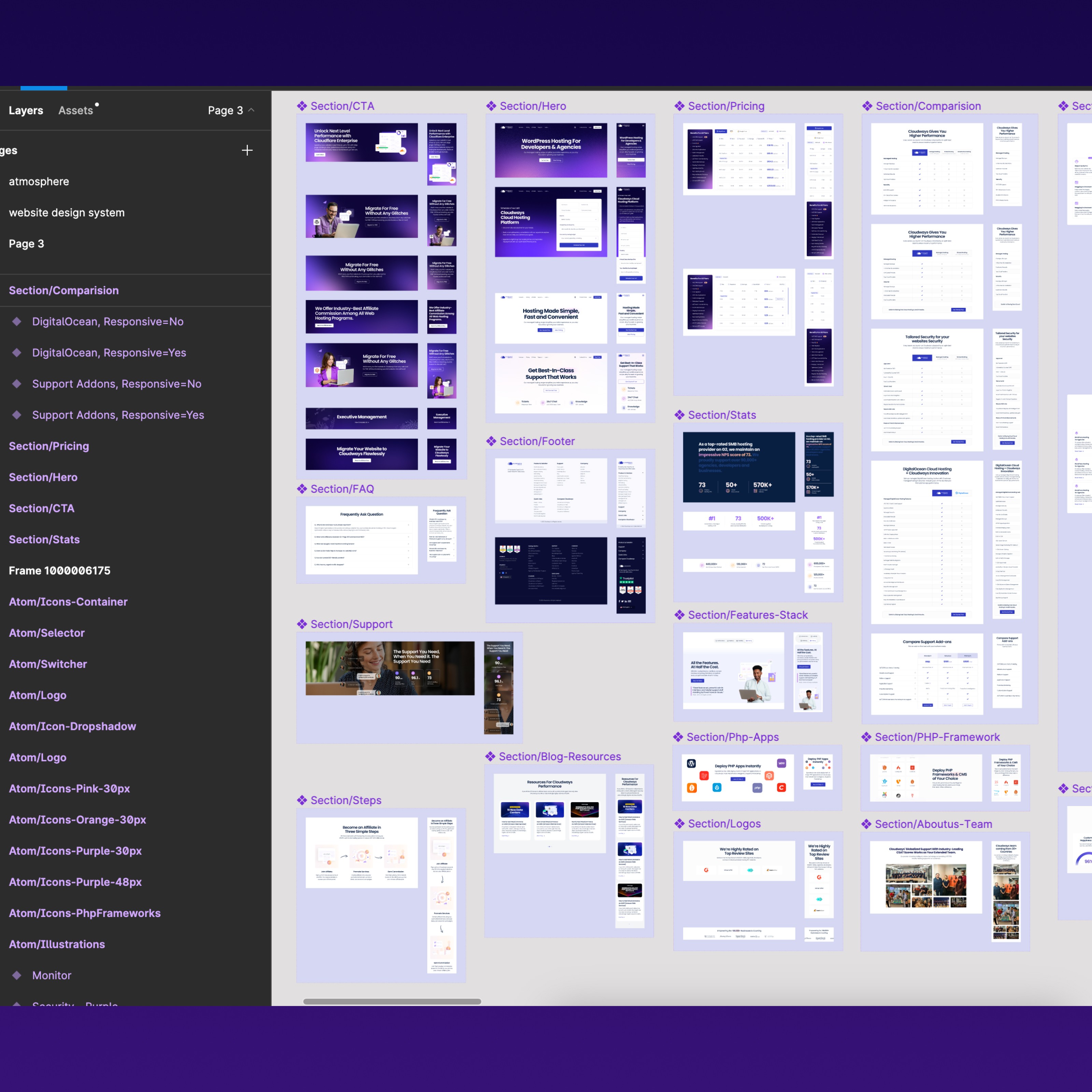
Cloudways Autonomous was designed within the Atmosphere Design System, the same system built during the Unified UX project. Ali led its application across Autonomous, with me auditing every component and pattern he introduced to ensure it maintained visual and behavioural consistency with the broader Cloudways platform. This mattered because Autonomous was a new product living inside an existing platform. Any inconsistency in component behaviour or visual language would have eroded the trust we were trying to build.
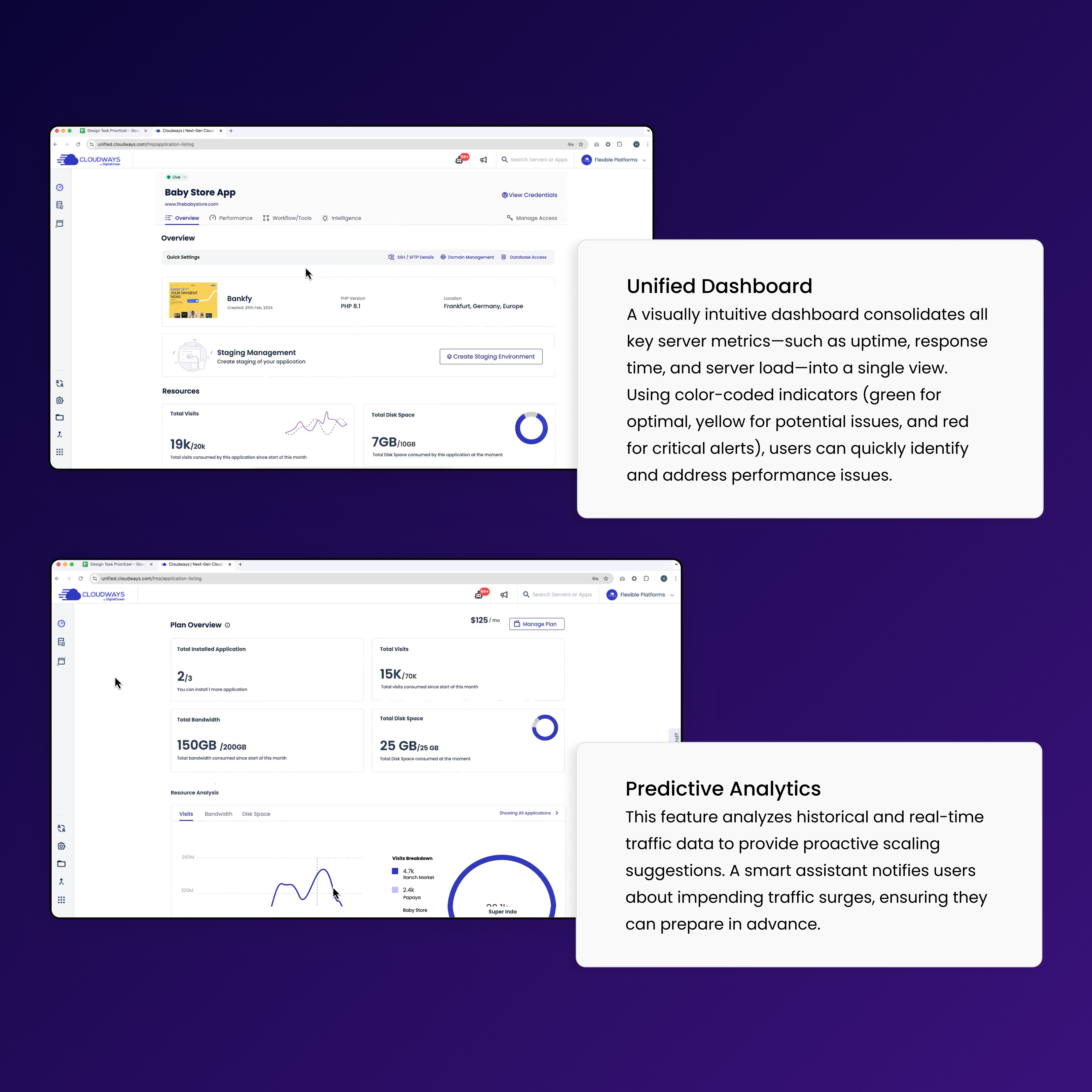
Working within Atmosphere meant the team could focus design effort on the genuinely new problems: predictive alert patterns, real-time scaling feedback states, and billing transparency, rather than rebuilding foundations. The design system is live at zeroheight.com/0f396b4ae.
04 - The decisions
We chose confidence over control, and simplicity over completeness.
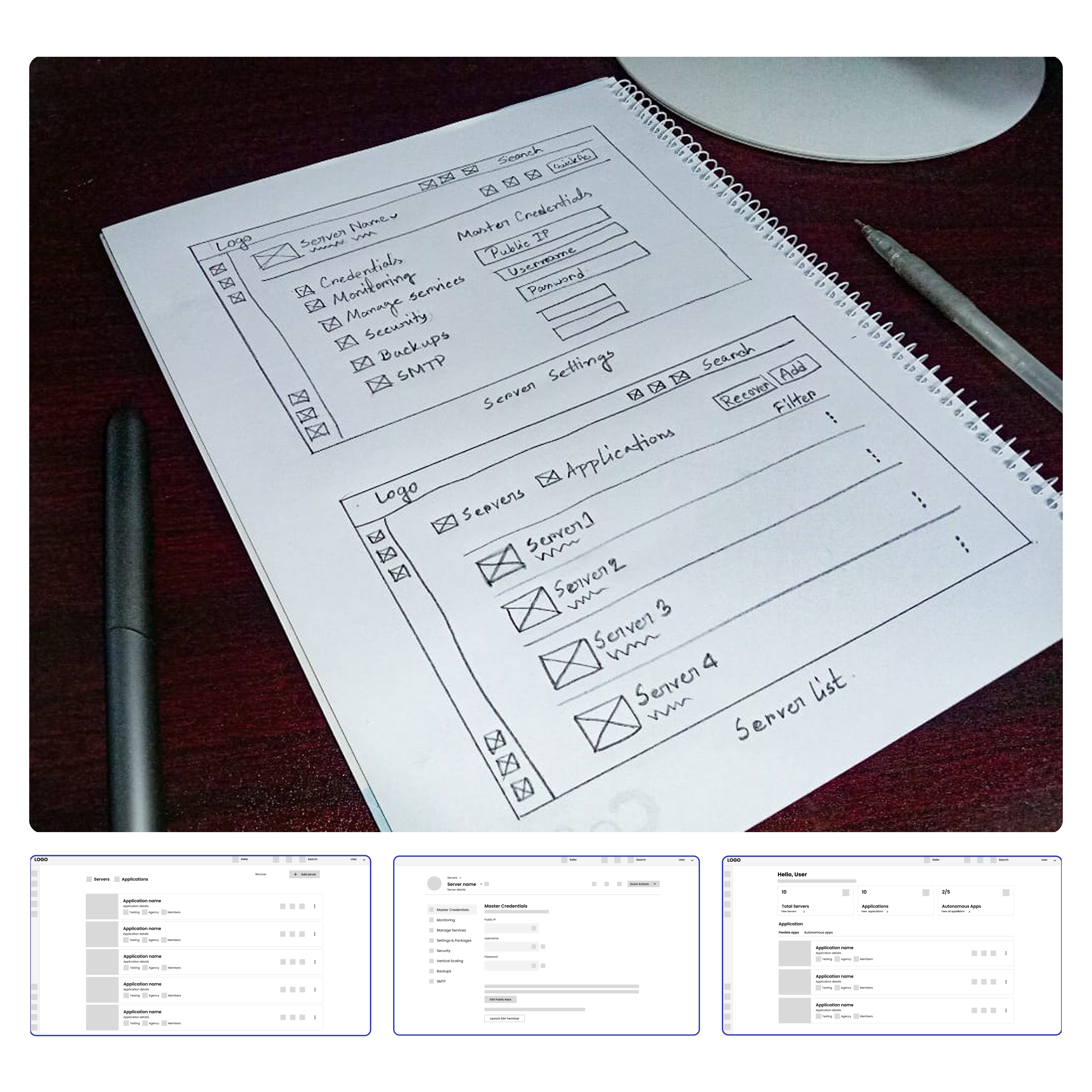
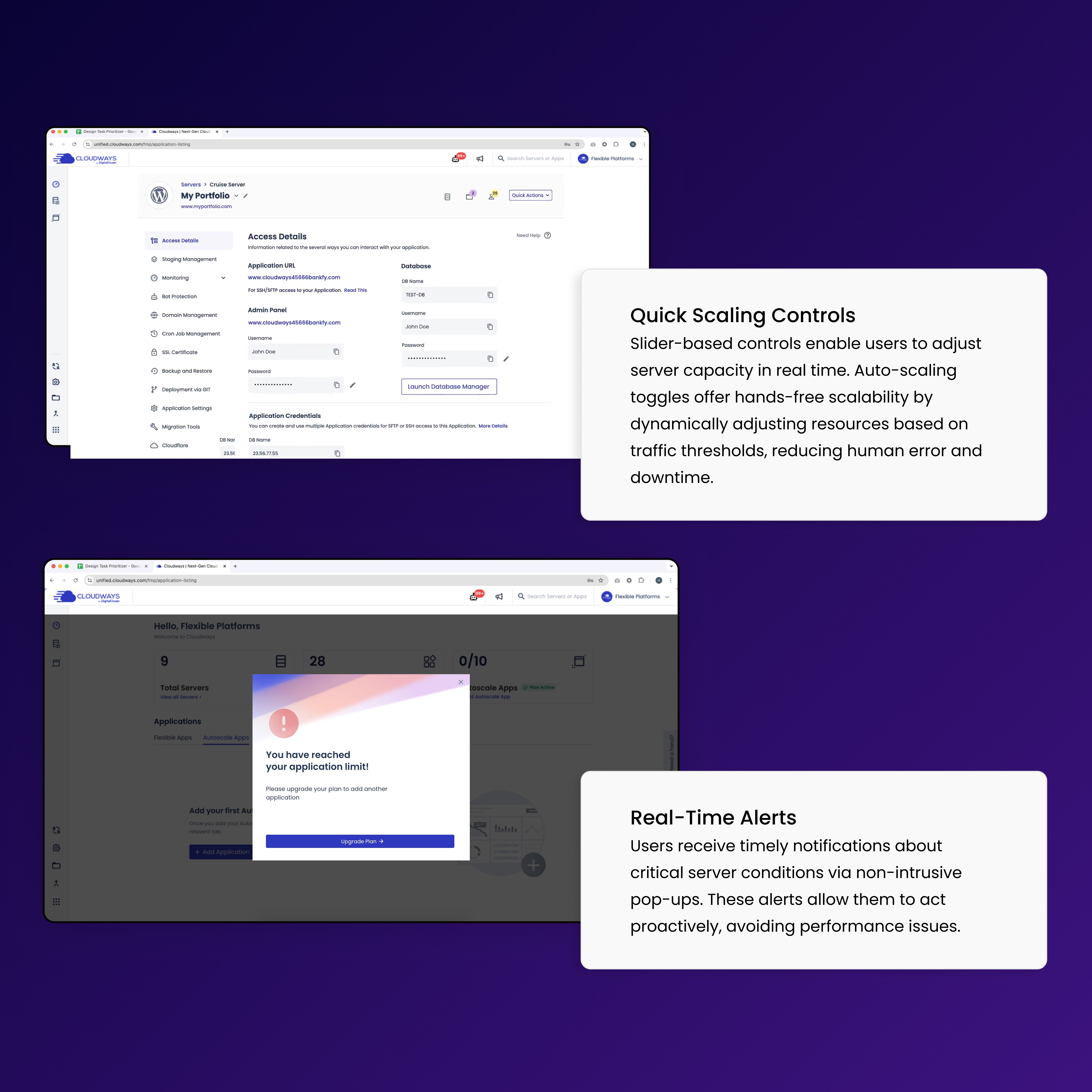
The first decision was the interface model. Engineering proposed a configuration panel where users would set scaling thresholds, select server tiers, and confirm changes across multiple steps. I rejected this. Our research had shown that the users most at risk during a traffic event were the least likely to navigate a multi-step form under pressure. We designed a single toggle for autoscaling and a single slider for manual adjustment. The entire scaling action took one tap. This was not a simplification of an existing flow. It was a deliberate replacement of a more powerful interface with a more trusted one.
The second decision was around alerts. We debated whether to show users real-time server data continuously or to surface only actionable moments. A continuously updating dashboard creates anxiety for non-technical users who cannot interpret what they are seeing. We chose predictive alerts instead, notifications triggered by real-time and historical traffic data, surfaced only when action was relevant. Users stayed informed without being overwhelmed.
The third decision was billing transparency. Surprise costs were one of the top pain points from research. We designed a cost preview that appeared before any scaling action confirmed, showing the projected charge in plain language before the user committed. This added one step to the flow but removed the single biggest source of mistrust identified in our interviews.
The notification system went through the most meaningful iteration of the project. In early testing, we surfaced a continuous stream of server health data, load percentages, traffic spikes, latency figures, presented as a live feed users could monitor at any time. An infrastructure manager in our second round of testing was direct: "I need to know when there's a problem, but I don't want to be flooded with technical data." We stripped the live feed entirely. What replaced it was a predictive alert model, notifications triggered only when the system identified an actionable moment based on real-time and historical data. Round one taught us that visibility without context creates anxiety. Round two shipped something quieter and far more trusted.
05 - The challenge
The team was aligned. Keeping them aligned through ambiguity was the real work.
There were no major stakeholder conflicts on Autonomous. That was not luck. From the first week, I brought the product team and engineering leads into the Figma files directly. Weekly reviews meant no decision accumulated into a surprise. By the time we reached high-fidelity, the team had already seen every direction we had considered and had input into what was rejected. Alignment was built in from the start, not negotiated at the end.
The harder challenge was internal. Midway through the project, our lead engineer suggested a change to the predictive algorithm that would have required us to surface more data in the interface to remain accurate. The simpler interface we had designed was built on the assumption that the algorithm would handle complexity invisibly. If that assumption broke, our entire design direction broke with it. I brought Iqra's user research back into the room, specifically the quotes around not wanting to be flooded with technical data, and we worked with the data science team to find an algorithm approach that preserved the simplified interface. The engineer's suggestion was genuinely good. We incorporated the technical thinking and protected the user experience at the same time.
06 - The outcome
A beta that converted. A product that held when it mattered most.
Autonomous launched to a beta group of 200 businesses. The results came back within the first high-traffic cycle.
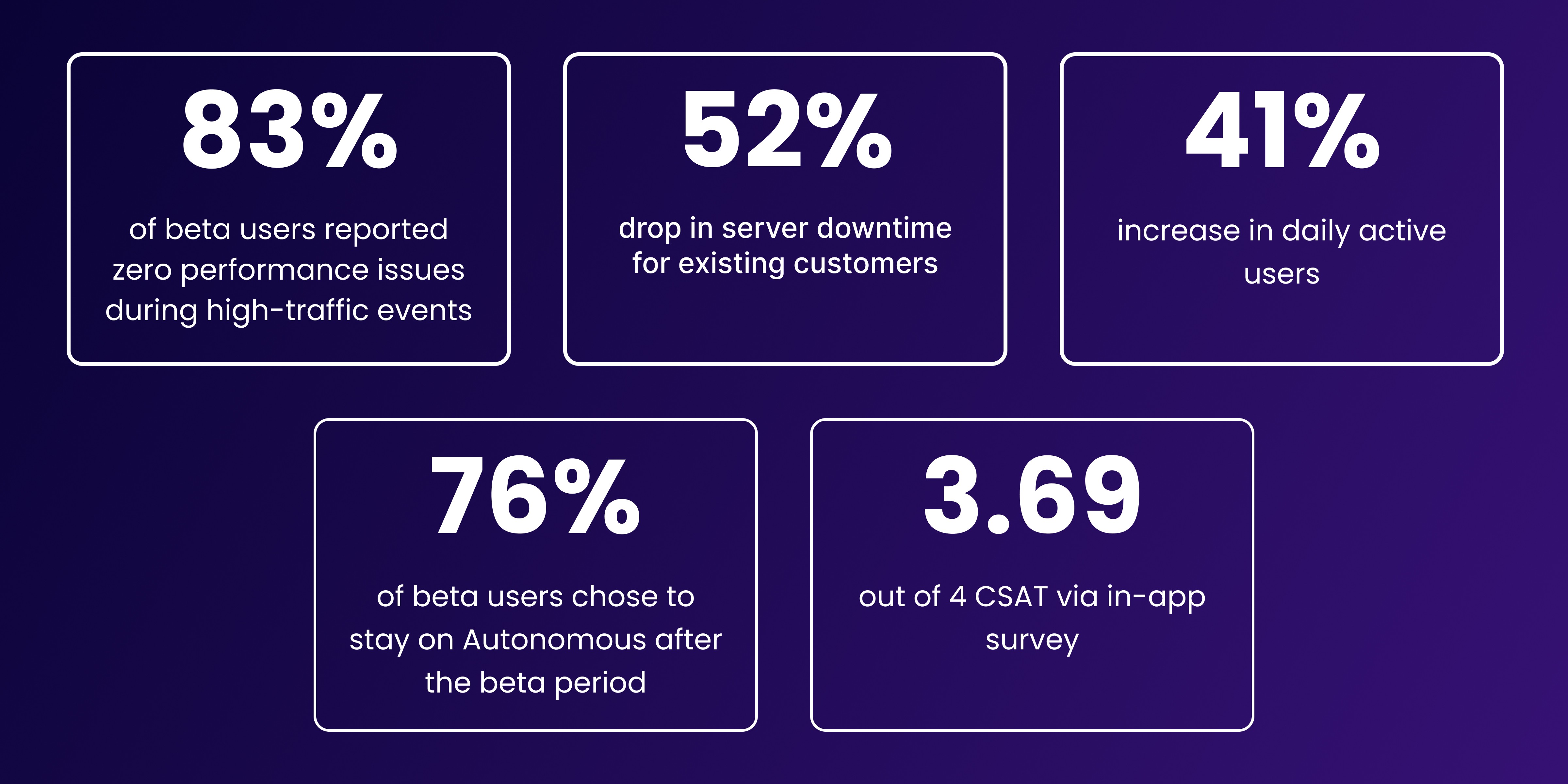
83% of beta users reported zero performance issues during high-traffic events without hiring external server support. This was the core measure we had set for ourselves. The product existed to remove the need for technical intervention. For eight in ten beta users, it did exactly that.
52% drop in server downtime for existing customers, measured directly on the platform and confirmed by the product team. The design decision that drove this was the predictive alert system. Users who previously reacted to crashes were now acting before them.
76% of beta users chose to continue on Autonomous after the beta period rather than revert to manual server management. Retention at the end of a beta tells you whether the product earned trust, not just interest.
41% increase in daily active users, measured on the platform. Users who had previously logged in only to check on problems were now engaging with monitoring and analytics features proactively.
3.69 out of 4 CSAT via in-app survey, collected at the end of the beta period.
Autonomous launched as one of Cloudways' flagship products following the $350M acquisition by DigitalOcean. It was the first major product shipped by the design team under DigitalOcean's ownership.
07 - The reflection
What I would do differently.
The biggest risk I took on this project was building on a single research finding. The insight that users wanted less control, not more, came from one researcher's interviews conducted during a separate project. It was a strong signal, but it was not independently validated before we committed to a design direction. On a project that ran for six to eight months, that is a significant risk. If the finding had been wrong, we would have discovered it very late. Today I would run a focused validation sprint before committing to any direction that fundamentally contradicts a natural user assumption. Two weeks of structured validation at the start is always cheaper than six months in the wrong direction.
The second thing I would do differently is the customisation layer. We designed Autonomous for the non-technical majority and gave advanced users a limited path to deeper control. In hindsight, the advanced user group was larger and more vocal than our research suggested, and their needs deserved more considered design rather than a late addition. I would scope the advanced configuration flow properly from the start rather than treating it as an edge case.